
Imagine walking into a bustling stock market, where stocks vibrate and pulse like a living organism. Now, if you had a way to visually capture all that excitement in a simple, colorful grid, voilà. Enter the world of heat maps. This handy tool can transform chaos into clarity, making stock market analysis feel less like a puzzle and more like a Sunday stroll. Whether you’re a seasoned trader or a curious newbie, understanding heat maps could be your secret weapon. Buckle up.
What Is a Heat Map?
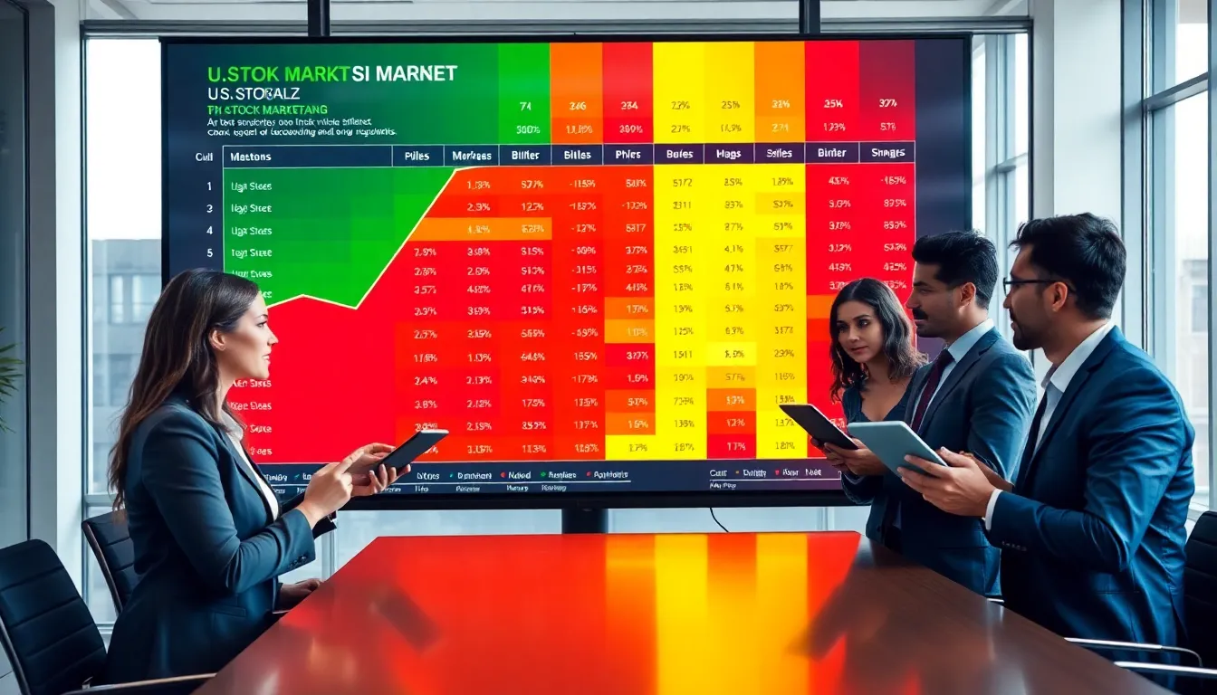
A heat map is a graphical representation of data that uses color to convey information. Specifically, in the stock market, it shows the performance of various stocks on a spectrum, from bright green indicating bullish (good) performance to deep red suggesting bearish (not so good) activity. Think of it as a weather map for the stock market: just as you can quickly see if it’s raining or sunny, you can instantly gauge which companies are thriving and which are struggling.
The beauty of heat maps lies in their simplicity. By condensing vast amounts of information into an easily digestible format, they help investors make quicker decisions. So, if you’re scrolling through a sea of tickers, a glance at a heat map could illuminate the landscape much faster than plowing through endless charts.
How Heat Maps Work in the Stock Market
Heat maps operate by visualizing stock price changes over a specific timeframe. They aggregate data, usually represented in a grid layout where individual stocks are displayed alongside their performance metrics. The color coding allows users to swiftly determine how a stock is performing relative to its peers in real-time.
When a stock’s price increases, it shifts toward the greener end of the spectrum. Conversely, if it dips, it turns red. This color-coded, immediate-feedback mechanism serves as an invaluable asset for anyone looking to stay ahead of the market trends. Traders can quickly spot stocks that are gaining or losing momentum without getting bogged down in individual figures.
Benefits of Using Heat Maps for Stock Market Analysis
Using heat maps for stock market analysis comes with an array of benefits. First and foremost, they enhance visibility. Instead of tediously sifting through reports, investors can see holistic market behavior at a glance, which allows for quicker thinking and action.
Secondly, they are excellent for spotting trends. If a sector is predominantly green or red, it often signals a broader market trend, providing insights that could lead to informed investment decisions.
Finally, heat maps can improve emotional decision-making. Because they provide immediate visual feedback, traders can avoid irrational reactions to single poor stock performances. Instead, they can focus on the big picture while navigating the unpredictable market waters.
Types of Heat Maps in Stock Trading
There are various types of heat maps utilized in stock trading, each catering to different analytical needs. For instance, sector-based heat maps display stocks grouped by industry sectors, allowing investors to grasp how specific industries are faring overall.
Another popular type is market-capitalization-based heat maps, which categorize stocks based on their market cap, offering insights at a glance for investors varying in portfolio size.
Finally, technical analysis heat maps compile indicators like volume and volatility, giving traders data necessary for deciding their next moves. Distinguishing between these types is crucial for any investor wanting to optimize their strategy.
Interpreting Heat Maps: Key Indicators to Watch
When delving into heat maps, there are several key indicators to monitor. First, pay attention to changes in color intensity. A stock that’s rapidly shifting from red to green might indicate a rebound, while consistent red could signal a downturn. Tracking sectors that flash predominantly green or red can also indicate market sentiment.
Also, consider market capitalization dimensions, larger companies might have a more stable momentum, while smaller companies can often exhibit more erratic behavior. Watching volume indicators is another critical element, as higher trading volumes can validate price movements, giving clues on whether the levels are sustainable.
Noticing these elements can help traders make smarter, more strategic moves.
Common Mistakes When Using Heat Maps
Even with all their benefits, using heat maps isn’t foolproof. One common mistake involves misinterpreting color intensity: traders may jump into stocks just because they look attractive on a heat map without considering other metrics. This can lead to regrettable decisions.
Another pitfall involves neglecting to check the broader economic landscape while focusing solely on the heat map. Market conditions, economic reports, and geopolitical issues can all impact stock performance. Ignoring these factors might lead to incomplete analysis.
Finally, failing to track long-term trends can be harmful. Heat maps are often best for short-term analyses. Overreliance on them for long-term strategies can stymie investors from developing a more nuanced understanding of stock behavior.